

")
As I was trying to come up with a title image for the updated displace modifier tutorial, I simply used it on Suzanne. The result reminded me very much of cubism style, more precisely of a painting I had to reproduce in school: Picasso's Three Musicians. I studied the original and realized:
- Most of the surfaces are next to shadeless.
- If I were to reproduce this, I'd get a terrific chance to finally play around with the freestyle options.
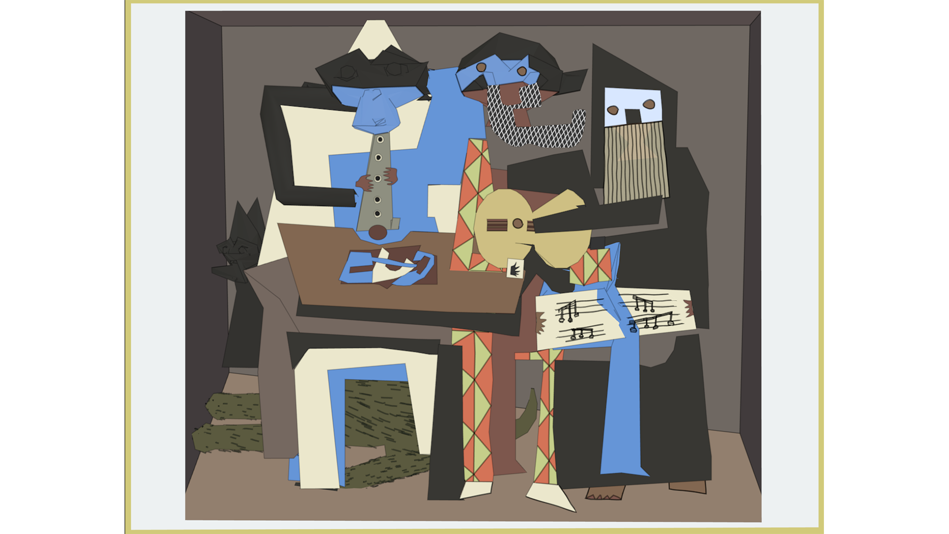
So, I decided to rebuild the scene using mostly decimated meshes. Suzanne is in there decimated three times and the legs from the tables are decimated beveled curves. The guitars are two joined and decimated cylinders but that's it. Most of the image is actually boring old modeling, using planes to follow the surfaces of the original.
The amazing thing about it was: since I did not construct this stroke by stroke as I did back in school, I actually assembled part by part, so I got a much greater overview on how important each piece actually is. Before I finished all the "layers" of the left table, there was clearly something missing. Every single one of them is so necessary to hold together the composition.
Also, there are three different kinds of surfaces.
- Most commonly used: shadeless (unicolored) parts.
- A simple pattern - the part that seems to be the pants of the middle musician.
- Somewhat textured: The background, and the two beards.
Again, each one is absolutely essential. I did not use any textures myself, the beards are done with freestyle and the help of an additional Render Layer. The pants I did with per poly materials. I did the wire texture of the left beard last, and once I was done, realized again how important these stylebreaks (is this a word?) also were.
One more thing I realized while trying to model the parts from one piece each: They don't fit. There is no correct 3D reproduction, even if you bend the edges. Especially the table. It doesn't look like it, but the objects could not fit on the table if this was a straight surface. Same goes for the room around the scene. The easy solution: subdivide the surface and push some of the vertices down. This way you can make the objects fit and since I used shadeless materials, you can't see it.
In conclusion: Would I have had Blender back in school, my appreciation for Picasso - and possibly other artists - would have been a lot greater. I probably would have given my art teachers a lot less of a hard time.